pacman::p_load(ggrepel, patchwork,
               ggthemes, hrbrthemes,
tidyverse) Hand-on2
Working on some new libraries
4 new packages beside tidyverse.
- ggrepel: an R package provides geoms for ggplot2 to repel - overlapping text labels.
- ggthemes: an R package provides some extra themes, geoms, and scales for ‘ggplot2’.
- hrbrthemes: an R package provides typography-centric themes and theme components for ggplot2.
- patchwork: an R package for preparing composite figure created using ggplot2.
Importing data
exam_data <- read_csv("data/Exam_data.csv")There are a total of seven attributes in the exam_data tibble data frame. Four of them are categorical data type and the other three are in continuous data type.
- The categorical attributes are: ID, CLASS, GENDER and RACE.
- The continuous attributes are: MATHS, ENGLISH and SCIENCE.
DT::datatable(exam_data, class= "compact")Beyond ggplot2 Annotation
ggrepel
One of the challenge in plotting statistical graph is annotation, especially with large number of data points.
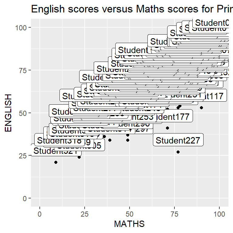
ggplot(data=exam_data,
       aes(x= MATHS,
           y=ENGLISH)) +
  geom_point() +
  geom_smooth(method=lm,
              size=0.5) +
  geom_label(aes(label = ID),
             hjust = .5,
             vjust = -.5) +
  coord_cartesian(xlim=c(0,100),
                  ylim=c(0,100)) +
ggtitle("English scores versus Maths scores for Primary 3")[ggrepel] is an extension of ggplot2 package which provides geoms for ggplot2 to repel overlapping text as in our examples on the right. We simply replace geom_text() by [geom_text_repel()] and geom_label() by [geom_label_repel]
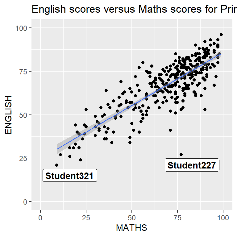
ggplot(data=exam_data,
       aes(x= MATHS,
           y=ENGLISH)) +
  geom_point() +
  geom_smooth(method=lm,
              size=0.5) +
  geom_label_repel(aes(label = ID),
                   fontface = "bold") +
  coord_cartesian(xlim=c(0,100),
                  ylim=c(0,100)) +
  ggtitle("English scores versus Maths scores for Primary 3")
ggplot2 Themes
ggplot2 comes with eight [built-in themes], they are: theme_gray(), theme_bw(), theme_classic(), theme_dark(), theme_light(), theme_linedraw(), theme_minimal(), and theme_void().
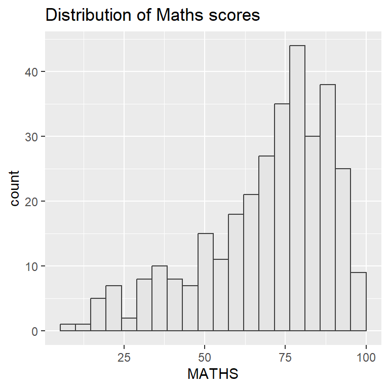
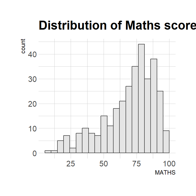
ggplot(data=exam_data,
             aes(x = MATHS)) +
  geom_histogram(bins=20,
                 boundary = 100,
                 color="grey25",
                 fill="grey90") +
  theme_gray() +
  ggtitle("Distribution of Maths scores")
Working with ggtheme package
ggthemes provides ‘ggplot2’ themes that replicate the look of plots by Edward Tufte, Stephen Few, Fivethirtyeight, The Economist, ‘Stata’, ‘Excel’, and The Wall Street Journal, among others.
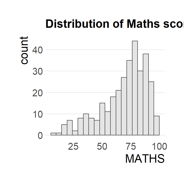
ggplot(data=exam_data,
             aes(x = MATHS)) +
  geom_histogram(bins=20,
                 boundary = 100,
                 color="grey25",
                 fill="grey90") +
  ggtitle("Distribution of Maths scores") +
  theme_economist()
Working with hrbthems package
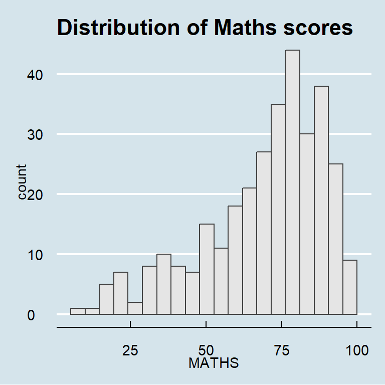
[hrbrthemes] package provides a base theme that focuses on typographic elements, including where various labels are placed as well as the fonts that are used.
ggplot(data=exam_data,
             aes(x = MATHS)) +
  geom_histogram(bins=20,
                 boundary = 100,
                 color="grey25",
                 fill="grey90") +
  ggtitle("Distribution of Maths scores") +
theme_ipsum()- The second goal centers around productivity for a production workflow. In fact, this “production workflow” is the context for where the elements of hrbrthemes should be used.
ggplot(data=exam_data,
             aes(x = MATHS)) +
  geom_histogram(bins=20,
                 boundary = 100,
                 color="grey25",
                 fill="grey90") +
  ggtitle("Distribution of Maths scores") +
  theme_ipsum(axis_title_size = 18,
              base_size = 15,
              grid = "Y")
What can we learn from the code chunk below?
axis_title_sizeargument is used to increase the font size of the axis title to 18,base_sizeargument is used to increase the default axis label to 15, andgridargument is used to remove the x-axis grid lines.
Combining Graphs
In this section, you will learn how to create composite plot by combining multiple graphs. First, let us create three statistical graphics.
p1 <- ggplot(data=exam_data,
             aes(x = MATHS)) +
  geom_histogram(bins=20,
                 boundary = 100,
                 color="grey25",
                 fill="grey90") +
  coord_cartesian(xlim=c(0,100)) +
ggtitle("Distribution of Maths scores")p2 <- ggplot(data=exam_data,
aes(x = ENGLISH)) +
geom_histogram(bins=20,
boundary = 100,
color="grey25",
fill="grey90") +
coord_cartesian(xlim=c(0,100)) +
ggtitle("Distribution of English scores")p3 <- ggplot(data=exam_data,
aes(x= MATHS,
y=ENGLISH)) +
geom_point() +
geom_smooth(method=lm,
size=0.5) +
coord_cartesian(xlim=c(0,100),
ylim=c(0,100)) +
ggtitle("English scores versus Maths scores for Primary 3")Working with patchwork
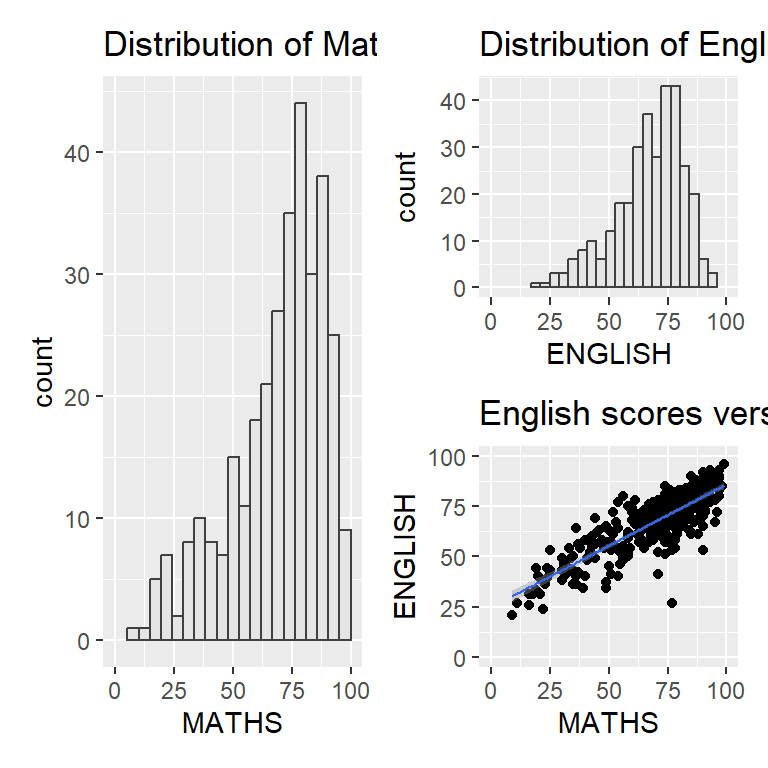
p1 + p2 / p3| will place the plots beside each other, while / will stack them.
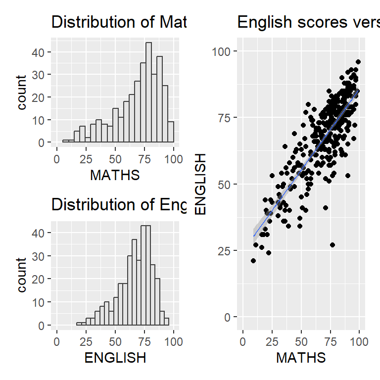
(p1 / p2) | p3patchwork also provides auto-tagging capabilities, in order to identify subplots in text:
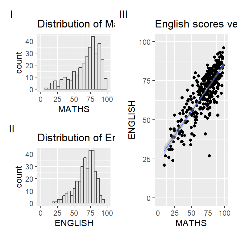
((p1 / p2) | p3) +
  plot_annotation(tag_levels = 'I')
Beside providing functions to place plots next to each other based on the provided layout. With inset_element() of patchwork, we can place one or several plots or graphic elements freely on top or below another plot.
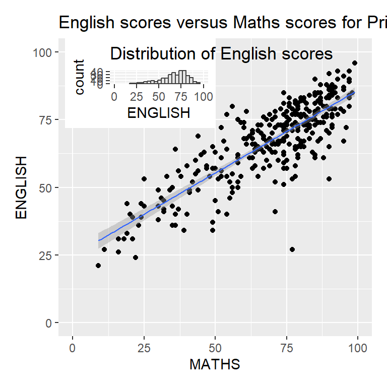
p3 + inset_element(p2,
                   left = 0.02,
                   bottom = 0.7,
                   right = 0.5,
                   top = 1)